Get started with Flash UI, a framework for building projects faster.
Quick start
Looking to quickly add FlashUI to your project?
CSS
Copy-paste the stylesheet into your before all other stylesheets to load my CSS.
Alerts
An alert displays a short,important message in a way
that attracts the user's attention without
interrupting the users task
Simple alert
There are 4 types of simple alerts - Primary,
Secondary, Success, Warning, and Error alerts. To
create an alert use the base class alert, and add
any one of the following class variations to it-
alert-success, alert-failure, alert-warning, and
alert-danger.
Success alert
Error alert
Warning alert
Danger alert
Paste the code below to use the alert
Outline alert
There are 4 types of outline alerts - Success,
Warning, and Error alerts. To create an alert use
the base class alert, and add any one of the
following class variations to it- alert-primary,
alert-secondary, alert-success, alert-warning, and
alert-error.
Success alert
Error alert
Warning alert
Danger alert
Paste the code below to use the outline alert
Avatars
Avatars are user profile pictures, usually found in
circular shapes. Avatars can be used for 'container'
objects — projects, spaces, repositories, etcetera —
to give them a recognisable visual identity
Circle avatar
This is the circle avatar .You can use the avatar
according to the screen size by using xl,lg,md,sm.
Paste the code below to use the circle avatar
Square avatar
This is the square avatar .You can use the avatar
according to the screen size by using xl,lg,md,sm.
Paste the code below to use the square avatar
Text avatar
This is the text avatar .You can use the avatar
according to the screen size by using xl,sm..
IY
IY
IY
IY
Paste the code below to use different variant of
text avatar
Badges
Badges are small circles, positioned either at
top-right or bottom-right of the parent component.
Badge can be used to display numbers, online /
offline status, depending on where they are used
Avatar Badge
Avatar Badge is used to show the current status of a
user.
Paste the code below to use the Avatar-badge
Icon-badge
Icon-badge is used to show the notification.
4
4
4
Paste the code below to use the icon badge
Buttons
Buttons are components user can click to perform an
action and interact with the website.
Primary Button
To generate a primary button, use the base class
btn.btn-primary and add any of the following
supporting classes to get different variations for a
primary button- btn-primary, btn-success, btn-error,
btn-default.
Paste the code below to use the Primary Button
Outline Button
To generate a outline button, use the base class
btn.btn-primary and add any of the following
supporting classes to get different variations for a
primary button- outline-primary,outline-sucsess,
outline-error,outline-default.
Paste the code below to use the Outline Button
Link Button
This is the Link Button .
Paste the code below to use Link Button
Icon Button
To generate a icon button, use the base class
btn.btn-primary and add any of the following
supporting classes to get different variations for a
primary button- btn-solid, btn-outline, btn-link,
btn-icon, and btn-text-icon
Paste the code below to use the Icon Button
Floating Button
Floating-action buttons can be customized by adding
the font-awesome icon of your choice
Paste the code below to use the Floating Button
Images
Image Components are used to dsiplay Images on
websites.
Square Image
Square Images are the square shaped, with a default
dimension of 150px X 150px.
Paste the code below to use the Image Component
Round Image
Round Images are the circular, with a default
dimension of 150px X 150px.
Paste the code below to use the Round Image
Responsive Image
Responsive Image Components are used to display
Images on websites, which are screen responsive.
They expand upto the width of the container they are
in.
Paste the code below to use the Responsive Image
Inputs
Inputs are necessary for user interaction with the
website. Inputs are used to take information from
the user, and then save the data to the server,
accordingly
Labeled Input
Label Input has a label present at the top of the
input field. They can be customized to show error
error-message, and change color accordingly.
Password don't match.
Paste the code below to use the Labeled Input
Validation Input
Validation input are used to validate the input
Label
Label
Label
Paste the code below to use the Validation Input
Drawer
The drawer component is a slide-in element that can
be used to display relevant information without
losing the context of the page
Permanent Drawer
It is a fixed drawer,that will be fixed to its
place.
Title
subtext
Inbox
Star
Sent mail
Drafts
lables
Family
Friends
Work
Settings
Settings
Permanent Drawer
Lorem, ipsum dolor sit amet
consectetur adipisicing elit. Quidem
sunt cum ullam totam, eum eveniet
dolore voluptatem vitae saepe iste
incidunt sed! Voluptas esse debitis
sit harum voluptatum temporibus
aliquid at soluta? Magnam voluptate,
aliquam obcaecati dolorum
repellendus blanditiis quis,
perspiciatis ipsam ad ratione, quae
minus cupiditate ipsum. Repudiandae,
laborum aliquid eveniet quae veniam
corporis sapiente doloremque
suscipit illo beatae.
Lorem ipsum dolor sit amet
consectetur adipisicing elit. Iste
repellendus omnis eius minima
recusandae tenetur itaque ducimus
delectus sint ea non, amet harum
molestiae aliquam. Perspiciatis quos
veritatis commodi minima iure
voluptas quae impedit ratione odio
numquam exercitationem possimus
doloribus reprehenderit, ea
asperiores voluptatem doloremque at.
Sint eos aspernatur sunt maxime
accusantium delectus fugit itaque,
officia consequatur et perspiciatis
dolorem.
Lorem, ipsum dolor sit amet
consectetur adipisicing elit.
Maxime, impedit, numquam a totam at
illum neque, dignissimos odit quasi
amet dolore voluptatibus commodi
rerum doloremque cupiditate odio ut
praesentium beatae aliquam corrupti?
Cum suscipit quos praesentium
aspernatur possimus, minima quisquam
nesciunt placeat fugiat illo
quibusdam esse a optio nulla ratione
ipsam? Nulla tenetur esse aspernatur
quisquam quasi ea dolores sed!
Lorem ipsum dolor sit amet
consectetur adipisicing elit.
Nesciunt ipsum maxime adipisci
itaque, totam similique quo
recusandae ducimus porro quibusdam
qui delectus sequi voluptate laborum
at harum nam cum dolor unde incidunt
quia. Veritatis rerum ducimus,
dignissimos pariatur odio cum nihil
cupiditate? Ut earum, iure fugit
veniam nostrum doloremque quis
deleniti cum, harum corrupti nulla
excepturi repudiandae itaque quam
delectus.
Lorem ipsum dolor sit, amet
consectetur adipisicing elit. Labore
nemo ipsum adipisci voluptatum
suscipit facilis atque quibusdam?
Expedita molestias rem corrupti
ipsam ut, vel culpa labore iusto
magnam laborum esse numquam facere
minima accusamus molestiae odit
dolor veritatis enim consequuntur.
Vel dolore quis reprehenderit natus
consequatur quas ab ut architecto
quisquam. Enim, inventore. Possimus
non, voluptatum ut nobis quisquam
tempore.
Paste the code below to use the permanent drawer
Submenu
Submenu
Title
subtext
Inbox
Star
Sent mail
Paste the code below to use the submenu
Typography
Example of headings
This is heading 1
This is heading 2
This is heading 3
This is heading 4
This is heading 5
This is a small text
This is colored text
Paste the code below to use different version of
Headings
Rating
Normal Rating
Paste the code below to use the Normal Rating
Number Rating
4.4
Paste the code below to use the Number Rating
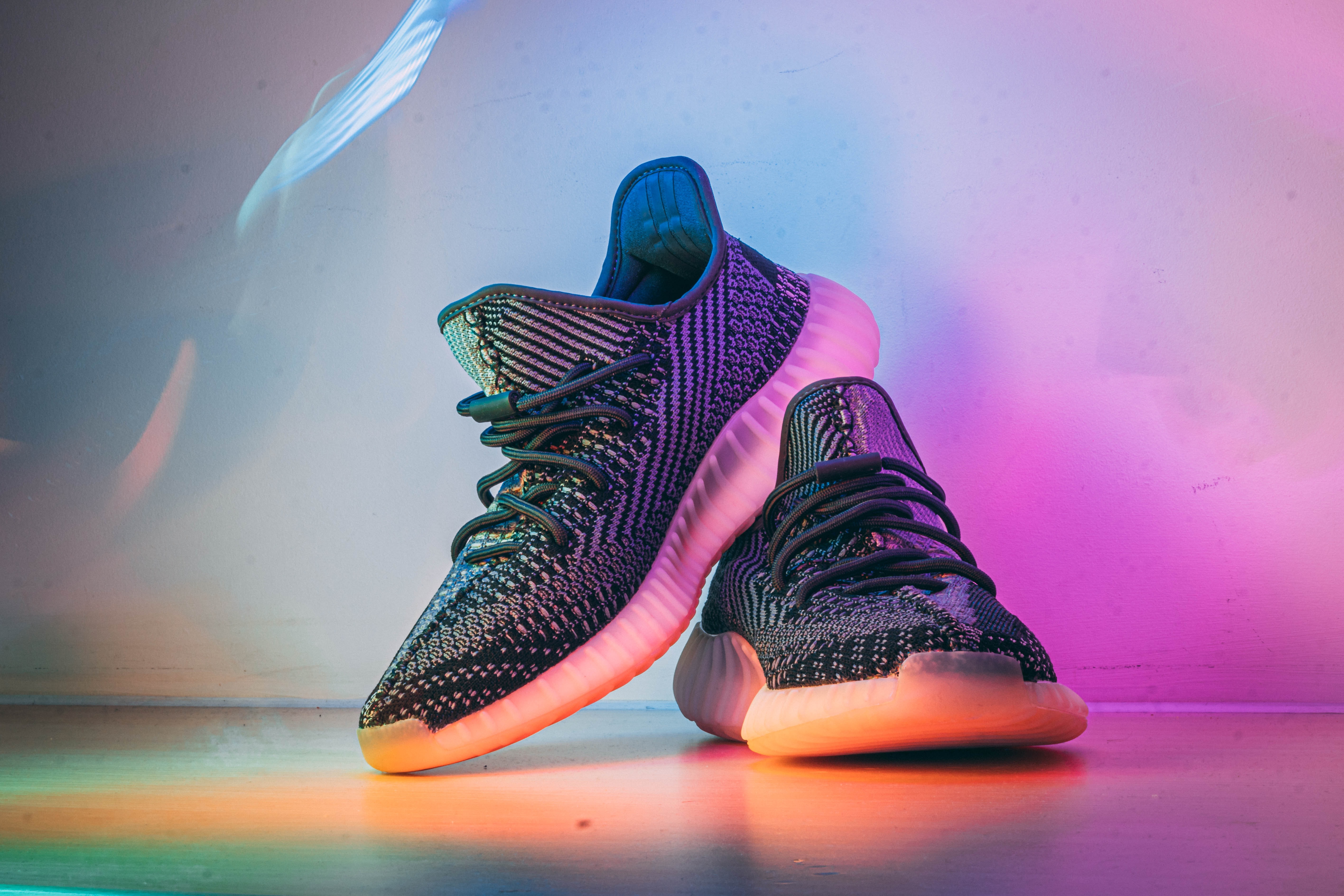
Card
Card with badge
NEW
Nikemax Sneakers
Price: $126
Paste the code below to use the Card with badge
Card with dismiss
Nikemax Sneakers
Price: $126
Paste the code below to use the Card with dismiss
Card with text overlay
OUT OF STOCK
Nikemax Sneakers
Price: $126
Paste the code below to use the Card with
text-overlay